Information Design // FLIP Classroom & Exercises
11.01.2023 - 24.02.2023// Week 1 - week 7
Lim Yi Xvan 0354552
Bachelor of Design in Creative Media
Instruction
FLIP Classroom
Week 1 // 12.01.2023
Flip 1 - Different types of infographics & online tools
We had our first flip classroom session in week 1, when we split into groups and had to research the various sorts of infographics, the types of information they apply to, and examples of each category.
Google Slides:
Week 2 // 09.01.2023
Saul Wurman's L.A.T.C.H
On week 2 , we must provide an overview of the subject and examples or scenarios showing how each concept should be applied to specific data.
Google Slides:
Week 3 // 26.01.2023
Miller's Law : Chunking
On week 3, our group gets the opportunity to present about the Miller's Law: Chunking. Along with that, Mr. Hafiz also showed us a video of a few games that use chunking techniques to train our brains. According to my understanding, Miller's Law is simply how information is organised and displayed, and it is also evident whenever we open a website or an application. Nevertheless there is a lot of information on the page that the user will see. As a result, we need to make an effort to learn how to run the website we're after. From the slider, layout, or navigation. Everything is set up by the designer to minimise the quantity of information that users must process. In order to make the information on our goods easier for people to use or understand, we must endeavour to arrange and accommodate.
Google Slides:
Week 4 // 02.01.2023
Manuel Lima's 9 Directives Manifesto
The Manuel Lima 9 Directives Manifesto, a set of guidelines for successful visual communication and information design, is introduced to us in week 4. Designer, author, and speaker Manuel Lima focuses on information design and data visualisation. His credo lists nine fundamental guidelines that, in his opinion, designers should adhere to when producing powerful and striking visual representations of data. Designers are encouraged by Manuel Lima's 9 Directives Manifesto to produce visualisations that are rich in detail, provide context, highlight the most crucial data, and tell an engaging story. Designers can produce visualisations that are not only aesthetically beautiful but also educational and impactful by adhering to these guidelines.
Google Slides:
Exercises
Exercise 1 // Quantifying Data
Week 1 // 12.01.2023
On week 1, we were assigned to get our hands on things like Legos and Buttons that we can classify and measure. Thinking of being creative, my first thought was to buy gummy bears, but then when i went to the supermarket and saw the price. haha no way I'm not spending so many money on this assignment so I've gotten myself a pack of skittles and I use the m&ms which my friend gave it to me.
 |
| fig 1.1 - skittles and M&Ms and Yoghurt Jellies |
 | |||
fig 1.2 - after arrangements
|
 |
| fig 1.3.2 - final presentation |
 |
| fig 1.4 - import into AI to add on texts and illustrations |
Final Outcome of Quantifying Data:
 |
| fig 1.5 - Final Quantifying Data in JPEG |
Exercise 2 // L.A.T.C.H. Infographic
Week 2 // 19.01.2023
This week, we're assigned to create another infographic poster using the L.A.T.C.H. principles:
- Location
- Alphabet
- Time
- Category
- Hierarchy
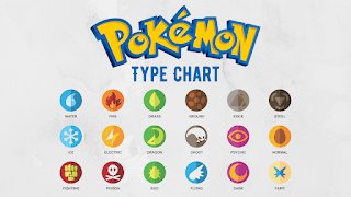
The infographic poster is the topic of Pokemon. At first, I'm like oh shit. I don't even know anything about this game and the characters and pokemons. Hence, I refer to the senior's posters and chosen out the most top used pokemons haha.
 |
| fig 2.1 - Pokemon Type |
 |
| fig 2.2 - Types of Pokemon |
Then, I went online browse for pokemon map and look for some materials. Then I was inspired by this which have clouds covered on the edges as a border. With this idea, I wanted to make something similar like this but on a map.
 |
| fig 2.3 - Pokemon Map inspiration |
Then, I bring it into PS and start masking the island into the vintage texture map and then added some smoke sky effect on the corner as a border. Next, I arrange the selected pokemon's generation and arrange them in a circle form to create hierarchy. To create contrast, I also added shadows for each of the pokemons with brush.
 | |
|
Final Outcome of L.A.T.C.H. :


Comments
Post a Comment